
But it wasn’t as simple as that. The details that bedevilled me began with my big idea to use masking tape to indicate the grid instead of tailor’s chalk (too dusty), disappearing-ink marker (fades too quickly) or basting (tedious).
That tape plan might have worked if I had removed it in a timely manner, like within a few days or even weeks. But when you pull masking tape off of fine white cotton sheeting after 13 months you are left with a hard, yellowed embedded adhesive residue. You scrape it, scrub it, attack it with solvents and still it does not un-adhere. In desperation, you ball up the entire quilt and chuck it into the washing machine, despite the raw edges and exposed batting. When it comes out in a tight mass of threads and shrunken batting you curse your hare-brained impulsiveness. You let out a little scream when you realize that the colours from many of those buttons have inexplicably run, bleeding all over the white cotton. (Lesson 2: Research your materials.) At this point you roll yourself up into a little ball and go fetal in a corner somewhere until you’re ready to rejoin humanity.
I wanted that euphoria again. I needed it. (Lesson 1: Avoid great expectations.)
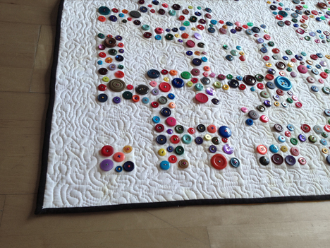
You attempt to find salvation from a bottle of stain-remover — Out, damned spot! Out, I say! — but it looks worse. The next time you have the nerve to look at this fabricated failure you notice that — praise the lord — the bleaching agent has worked — sort of. You stipple-quilt out the sags and bags and the rest of the discolouration disappears — also sort of. You trim it square and bind it in black with a devil-may-care attitude. After it’s finished you realize that the stippling was essential for creating enough rigidity to prevent the buttons from sagging when it hangs. You like the resulting topography. (Lesson 4: Innovate solutions.)
Then you air the whole sordid story on your blog, knowing that sharing the anguish is part of the process, though you regret you don’t have any images that would give the full impact of the horror story. (Lesson 5: Photodocument the process, even failure.)
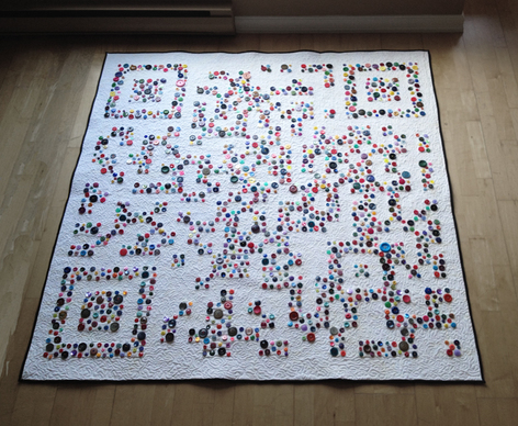
The title of this work is Discomforter (The Devil is in the Details). It’s a cumbersome title befitting this project that took me to the edge of my sanity, or at least close enough to see that there is in fact an edge and I know I can’t go there again.
Recent Comments